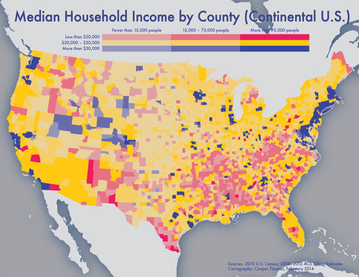
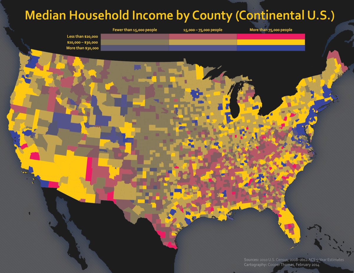
This map, like many, began as an experiment. I was told to produce a thematic map – any thematic map – for my geovisualization course, and I wanted to try something new. Value-by-alpha maps use color to symbolize one variable – in this case, median income – and transparency to symbolize another (raw population). So, it’s a neat, if not always effective, way to visualize multiple variables simultaneously, especially if they’re both sequential and/or one is used to normalize the other.
I had trouble finding a color ramp that worked well, and I so created a light version and a dark version of the map. The light version is probably more legible, but the dark one looks more badass, I think.
PS sorry Alaska and Hawaii!


