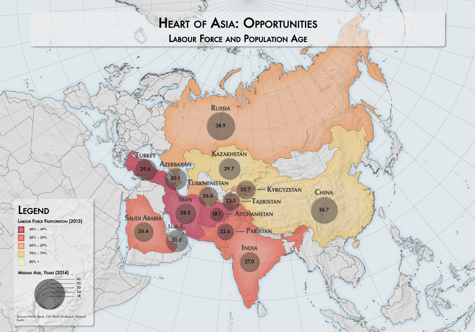
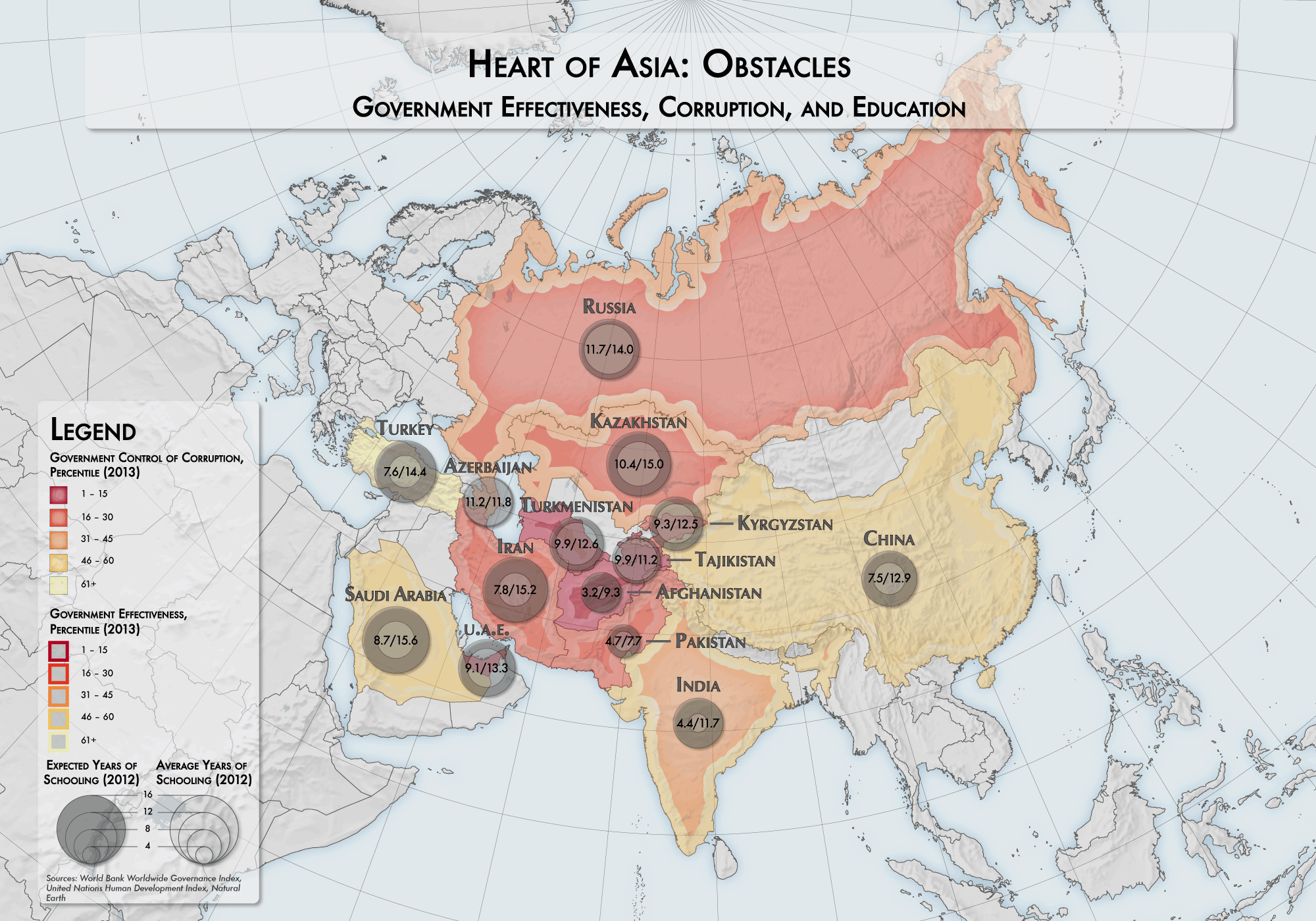
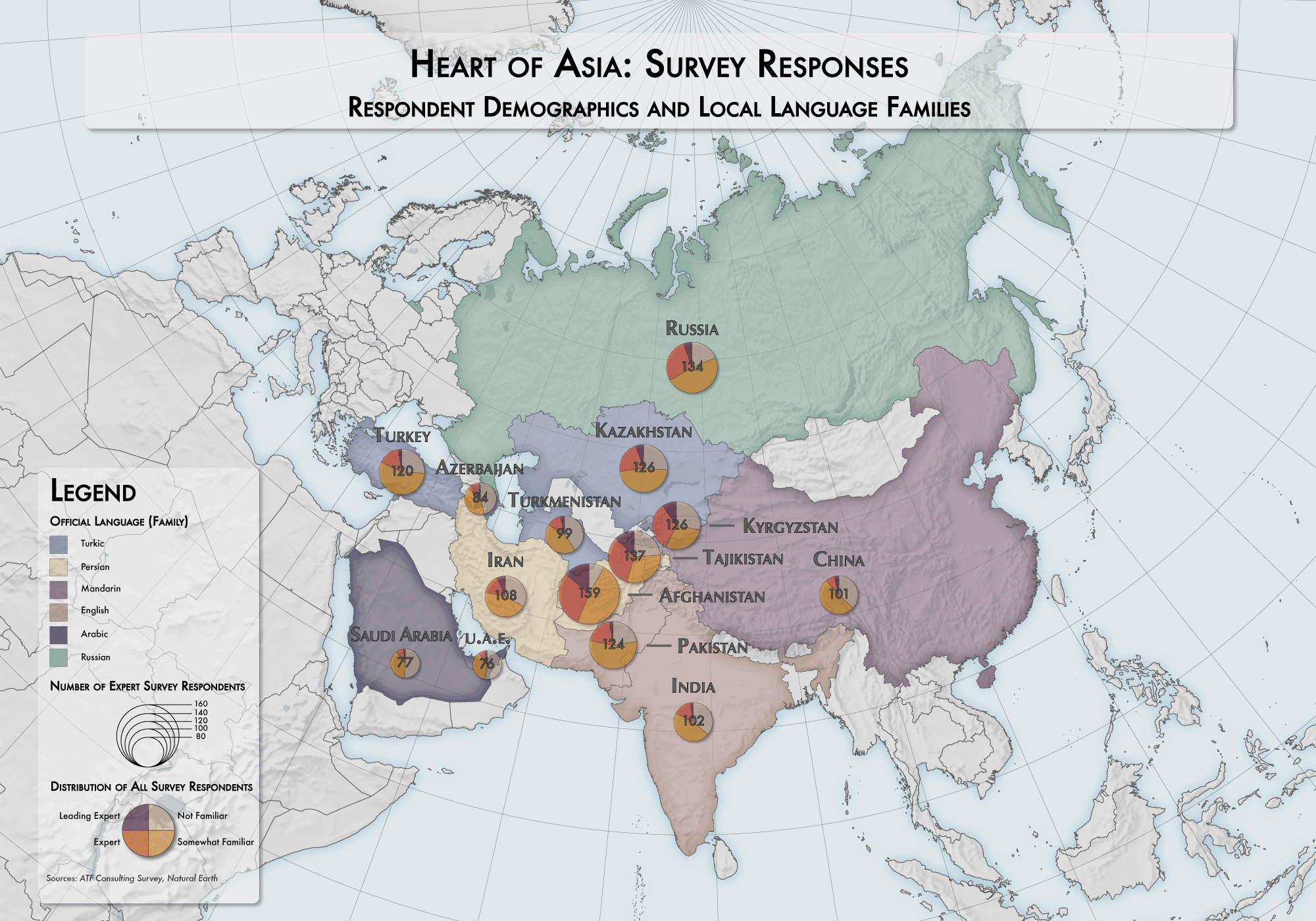
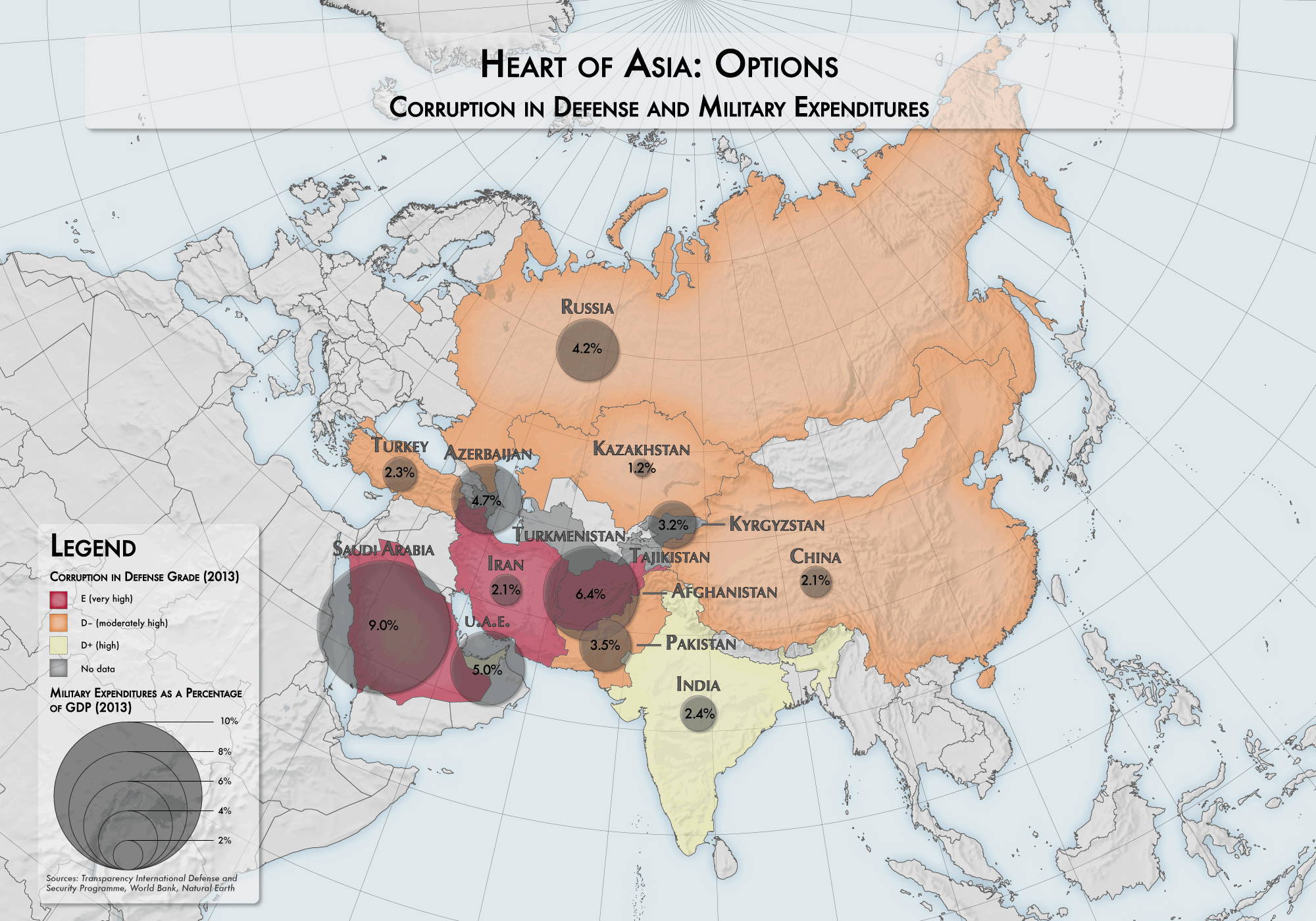
Toward the end of my stay in Kyrgyzstan, I was contacted by a Bishkek-based researcher in need of some thematic maps for an EU-sponsored study on regional security in Central Asia. On paper, the assignment seemed simple enough: produce a handful of simple choropleth maps, maybe a bivariate map or two, using data cleaned and provided by the affiliated consultancy administering surveys on the ground. Of course, the task proved much more difficult than this.
First, I had to spend an inordinate amount of time preparing the data in Excel. This is the least enjoyable part of any cartography project. It’s one thing to use a spreadsheet editor to actually explore the data, and look for interesting relationships; it’s another to push cells around, format text entries so that they don’t appear in Wingdings, freeze formulas, and complete other menial tasks to ensure that the data plays nice with a GIS.
Second, I had to adhere to a somewhat rigid aesthetic framework, which included guidelines for color treatment, symbology style (e.g., proportional symbols, pattern fills), and – perhaps most significantly – the specific variables represented on each map. It’s difficult to visualize more than a couple of variables on a single map – from a usability perspective, multivariate maps are often uncompromisingly complex and difficult to unpack, and from an aesthetic perspective, they often appear cluttered. For this assignment, I had to cram up to four variables on a single map – a new personal record, I think.
Removed from their intended context (an explanatory report), these maps aren’t particularly compelling. Still, the casual viewer might identify some interesting patterns and trends (check out the discrepancy between expected/actual education in some of these countries!).


