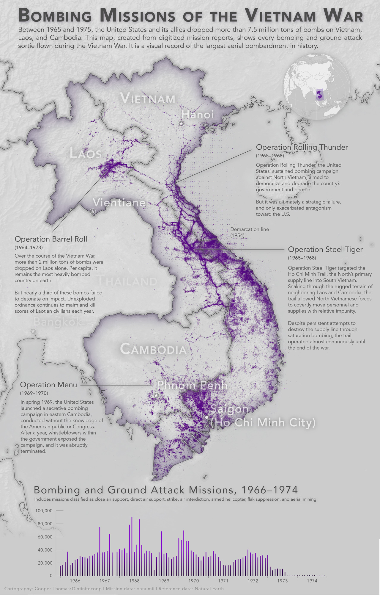
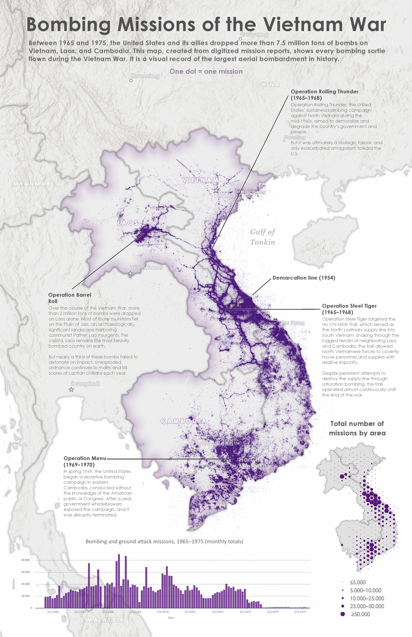
The other day, while casually browsing for interesting geospatial datasets (as you do), I came across an enticing trove of map-worthy material: the U.S. Department of Defense’s recently released Theater History of Operations data, a comprehensive database of historical U.S. bombing missions from World War I through the Vietnam War. As a kid, I was fascinated with military aviation—I read the “Encyclopedia of 20th Century Air Warfare” cover to cover nine times, and built two dozen scale airplane models, hanging them from my ceiling with fishing line—and so I was naturally eager to take a crack at the data.
I decided to begin by mapping the Vietnam War dataset—the largest of the bunch, by some distance. After downloading the Vietnam War dataset as a CSV (which tipped the scales at a hefty 1.6GB), I brought it into R for some basic cleanup and analyses. Specifically, I standardized the dates, some of which had been entered improperly; I removed unwanted records, including non-combat missions and missions with invalid target coordinates; and I aggregated the number of bombing and ground assault missions per month, to visualize in a column chart. The original dataset contained about 4.6 million unique missions; I managed to whittle this down to about 3.1 million missions. Much better!
Next, I brought my refined dataset into QGIS (avert thine eyes, my Esri colleagues! I have to run ArcGIS Pro in a VM on my MacBook, and it kept choking on the layer) along with some reference layers from Natural Earth, and applied some simple styling. Each mission is represented by a single, nearly transparent point, so that isolated missions are hardly visible, while areas of intensive saturation bombing are nearly opaque. Finally, I brought the map into Illustrator, where I added the chart of monthly missions and the annotations.
UPDATE, JUNE 2017: I originally created this map in QGIS, because (unlike ArcGIS), QGIS runs natively on my Mac. Earlier this year, however, I gained access to a powerful new PC, and so I decided recreate this map exclusively ArcGIS Pro. No Illustrator. No Photoshop. Just old-school GIS cartography. Although I’d used Pro quite a bit for geoprocessing tasks and cartographic pre-production, this was my first real deep dive into its cartographic toolset. And overall, I was tremendously impressed. To be sure, there were a few features I missed from earlier versions of ArcMap—e.g., the ability to modify coordinate systems and create custom projections, convert labels into annotations for improved placement (both of which were added at Pro 2.0, which was released shortly after I finished the map)—and I could’ve completed certain design tasks more efficiently in QGIS or Illustrator. But at the end of the day, there’s a certain satisfaction that comes from doing an entire project, start to finish, in a single application. And truth be told, I think I like the Pro version, below, better than the original QGIS version. What’s your take?
I documented my entire Pro workflow, and converted it into a tutorial. It’s now available here, if you’d like to recreate the map yourself. The map is also featured in Esri’s Maps We Love gallery. You can view the entry here.


